
Twitch is the world’s largest live streaming platform, enabling anyone to stream and build communities around a shared interest. The livestreaming market, however, is highly saturated. It’s hard to decide who to watch, what to watch, and how to do so effectively.
As a personal passion project, I set out to design a central home for short-form content on Twitch, consolidating Twitch’s existing Clips feature into one place where users can consume and share them. My goal was to improve discoverability so that viewers could find more communities to call home, ultimately benefiting the growth of smaller streamers as well.
May - Oct. 2021
(6 months)
Product Designer
Kelly Chong
Mentor: Jennifer Wong
Figma
Upon starting this project, I interviewed 5 small streamers to understand what their challenges with the platform are. Above all, discoverability on the platform was the top cited challenge.
To investigate why, I spoke to 5 existing Twitch viewers to test the current content-discovery and viewing experience (1a). Additionally, I explored Twitch UserVoice–Twitch’s existing user feedback system–as well as threads on r/Twitch to act as supplements to my research (1b). I also conducted an individual app audit to fill knowledge gaps and pinpoint any key issues (1c).

.gif)
Viewers must scroll through streams to "find" something to watch, with limited info to base said decision off of.
When I browse, I would usually click a streamer and then not vibe with them. I have to click into streams several times until I find something relevant, but then I just get tired.
I give up because it’s too hard.
~ An interviewee's comment while recalling frustrating experiences they had on Twitch
From my interviews, two main user types emerged: 'pure fans' who want to consume the content they want, fast. This means focusing on experiences enabling quick and easy actions.
On the other hand, there are 'explorers' who may not have creators they enjoy deeply yet but desire curation and connection. Their primary aim is to discover more communities to call home.


Turning to Twitch's existing customer feedback platform, Twitch UserVoice, I sought additional feedback that could potentially answer some of my questions around discoverability. I also sifted through issues people had in the r/Twitch subreddit.
In general, most people appeared to have concerns with the way discoverability was currently set up, and how it promotes a "king of the king's" structure where those with the highest views get rewarded while lower view counts are pushed to the bottom of the directory. While there were debates on what the best solutions were, the underlying consensus was that Twitch's discoverability algorithm needs work.
Clips are 1-60 second long snippets of an existing live stream. Clips are ‘clipped’ by the community, so a streamer doesn’t personally upload them (unless publishing on other platforms).
From my audit, I found that to access clips from the web app there are 3 entry points: A) Scroll to the end of the home page, B) Filter a streamer's videos by clips on their channel, or C) Click any category in Browse and select the Clips tab.


The 3 existing points of entry to experience Clips on Twitch.
This experience is fragmented, which is an issue because burying Clips underneath different sections makes it less discoverable. Short-form content is one of the best and fastest ways for a creator to get discovered, and for a viewer to discover streamers without having to sit through an entire stream. It’s harder to retain viewers when they can't tell what content is worth their time.
My main design goal is to make it easier and faster for viewers to consume relevant content (relevant as in entertaining, educational, and/or suits the viewer's interests). This not only directly increases revenues for Twitch, but indirectly does so since streamers are motivated to continue streaming.
When approaching ideation, I prioritized exploring volume and the breadth of what was possible; out-of-box solutions for enabling viewers to discover relevant, tailored content quickly whenever they land on Twitch's website. Out of a few conceptual directions explored, I decided having a central hub for clips would have the most direct impact in solving viewer pain points.


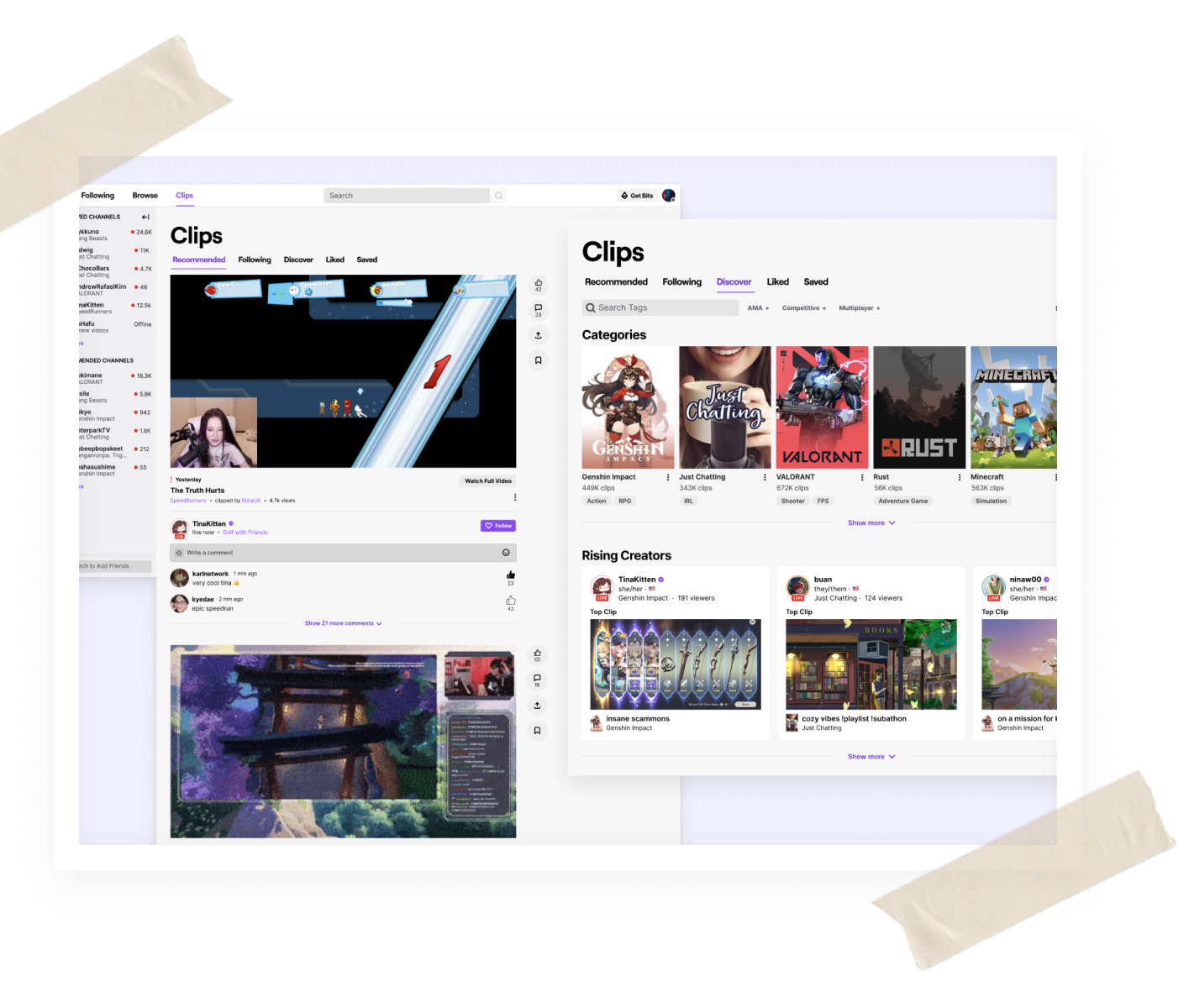
Moving forward, I decided to focus on centralizing short-form content on Twitch, with Clips at the forefront.


From these approaches I decided to pursue the ideas in Approach #1, a recommended feed, as based off of feedback it tied back to my main goal of making relevant content more discoverable the best.
After experimenting with different iterations for the Clips hub, I wanted to uncover any usability issues and/or mismatches in expectations, as well as marginal benefits of the feature. Was this something Twitch users would embrace or love to use? If not, what could be improved? This is what I found after talking to and testing designs with 5 viewers comprised of both new and long-term users:
While testing the flow, 3/5 users reported confusion surrounding the tabs 'Recommended', 'Following, and 'Discover.' They weren't sure what the difference was between them. To address this, I changed the copy from 'Discover' to 'Browse', which was more distinct from the other two tabs and more consistent with Twitch's existing information architecture.
While testing interactions with clips, users failed to notice the actions underneath a clip i.e. like, comment, share as it blended in with the information. I then moved the actions to the right of the clip for easier and faster access to clip engagement. Along with this decision, I removed the filter sidebar as it was redundant when you could already filter in Browse.


Before and after comparisons of this interactions test.
While users generally liked the concept of being able to bookmark certain clips by 'liking' and 'saving' them, they felt it was too difficult to actually retrieve clips they saved due to the infinite scroll format. There was also confusion over the difference between 'liked' and 'saved'. I decided to transform the views within these two pages in a familiar grid layout instead to easily view at-a-glance all liked and saved clips.
In this central hub, I created various sections to organize Clips:
While I don't work at Twitch and may not know the full picture of the product, Clips as a feature, engineering capacity, or know the users as intimately as the research team might—I have confidence in the adoption of this idea should it follow an appropriate validation and iteration cycle. I believe success could be measured through these metrics:
. As an active user in the space, there were so many areas I wanted to explore and address but ultimately had to scope it down to one problem for feasibility. This study was actually the result of multiple rounds of problem definition and scoping - I had a lot of trouble figuring out what was the right problem to work on, and understanding if the issues were actually issues. But I enjoyed all of it as part of the process and it felt really good to finally gain some clarity after the initial struggle :)
I wouldn't have been able to produce what I did without the help of mentors and friends who inspired me along the way to keep pushing through and really pinpoint what it is I wanted to solve and why it was important. Special thanks to those people (in no particular order): Jennifer Wong, Estelle Chung, Kevin Duong, Liam Ramsey, Christina Chen, everyone from PDF Cohort 1
Given the scope of this project, I wasn't able to address every single issue that surfaced. Here are some of the considerations I had and potential avenues for solutions I would want to explore with more time:
There's still a lot I'd love to explore and flesh out further, so if any of this resonates feel free to contact me with your feedback via the links below!
